Radix UI
Components, icons, and colors for building high‑quality, accessible UI. Free and open-source.
What it is
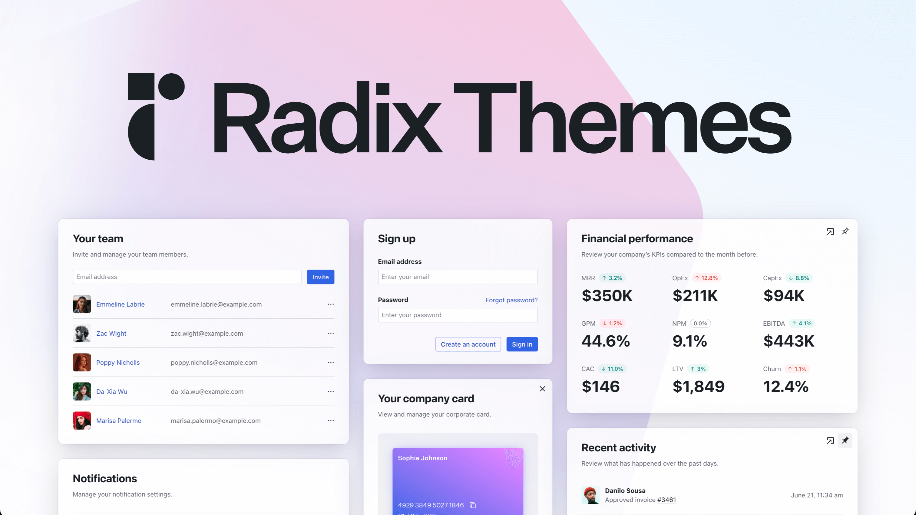
Radix UI is an open-source React component library designed for building web applications. It is optimized for fast development, easy maintenance, and accessibility. The library is aimed at developers and teams who want a collection of high-quality, un-styled UI primitives and a ready-to-use, themed component system that requires no configuration.
Main Features
Themed Components
- Pre-built, styled components like buttons, cards, and form elements
- Optimized for development speed with no configuration required
- Consistent design and accessibility built-in
Primitives
- Low-level, un-styled UI components offering full customizability
- Provide complete control over styling and behavior
- Act as foundational building blocks for custom design systems
Design Assets
- A comprehensive set of icons
- A color system for consistent theming
How it works
Rapid Application Development
Developers can start using the themed components by importing the library's CSS file and the desired components. The components are pre-styled and functional out of the box, allowing for immediate implementation without the need for custom styling or accessibility setup.
Custom Component Building
For developers needing full design control, the Radix Primitives offer headless components. These provide all the functionality, accessibility, and behavior without any pre-applied styles, enabling developers to build fully custom user interfaces on a robust foundation.
Theming and Styling
The library includes a <Theme> component to easily apply a consistent theme across an application. The provided color system and icons ensure visual consistency.
Key Points
- The library is open source and free to use.
- It is built with a strong emphasis on accessibility, ensuring components are usable by everyone.
- The unstyled primitives and themed components cater to different developer needs, from rapid prototyping to fully custom designs.
- It is built and maintained by WorkOS.
Additional Details
- The main library is available via npm:
@radix-ui/themes - Usage requires importing the core CSS file:
import @radix-ui/themes/styles.css; - Comprehensive documentation and a live playground are available on the official website for exploration and learning.