HeroUI v3 (Previously NextUI) - Beautiful by default, customizable by design.
Beautiful, accessible React UI components built on React Aria and Tailwind CSS v4. The modern alternative to MUI, Chakra UI, and shadcn/ui for building production-ready applications.
HeroUI Docs Themes Components React Native Blog Roadmap Theme HeroUI Native v1.0.4 - Typography, soft palette, vibrant theme & Expo 56 Beautiful by default. Customizable by design.
HeroUI is the modern UI library for web and mobile, built to help you move fast, stay consistent, and deliver delightful user experiences.
Get started View components Open source with 29.4k stars Your email We won't share your email State Select one Florida Delaware California Texas New York Washington Price $250.00 1D 7D 1M 1Y All Chats Emails Actions New file Create a new file ⌘ N Edit file Make changes ⌘ E Danger zone Delete file Move to trash ⌘ ⇧ D +5 Verify account
We've sent a code to a****@gmail.com
4 3 2 0
Didn't receive a code?
Resend Click me Click me Click me Click me Click me Click me HeroUI @hero_ui
Building the future of UI for web & mobile. 🚀 (YC S24)
4
Following
97.1K
Followers
You have 2 credits left
Get a paid plan for more credits Upgrade Allow notifications Receive push notifications from HeroUI Create an account
Start your free 7-day trial. No credit card required.
Get Started
OR
Continue with Google Continue with Apple
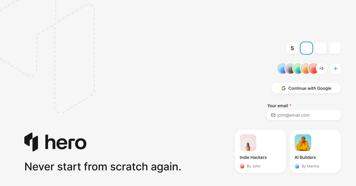
Indie Hackers
148 members
By John
AI Builders
362 members
By Martha
Unsaved changes
Do you want to save or discard changes?
Discard Save changes
© 2026 NextUI Inc. All rights reserved.
Twitter Discord GitHub Now available Build faster with HeroUI Pro
Components, templates, and AI tooling for React and React Native. Made for teams that care about the details.
Close Explore Pro