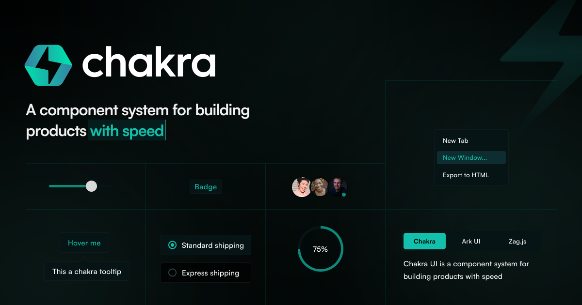
Chakra UI - A simple, modular and accessible component library that gives you the building blocks you need to build your React applications.
Simple, Modular and Accessible UI Components for your React Applications. Built with Styled System
What it is
Chakra UI is a modular and accessible component library designed for building React applications. It provides developers with a set of pre-built, reusable UI building blocks to accelerate front-end development. The library is intended for React developers seeking to create user interfaces quickly without sacrificing accessibility or customizability.
Main Features
Core Design Principles
- Simple: Offers an easy-to-use API for rapid development.
- Modular: Components are built to be composable and reusable.
- Accessible: Adheres strictly to WAI-ARIA standards for inclusive design.
Functionality
- Themeable: Components can be fully customized to match specific design requirements.
- Composable: Designed for composition, allowing developers to easily create new components.
- Light and Dark UI: Native support for multiple color modes, including light and dark themes.
- Developer Experience: Focuses on productivity with a well-documented and intuitive API.
How it works
Building React Applications
Developers import Chakra UI components directly into their React projects. They use these pre-styled, accessible components as building blocks to assemble user interfaces, rather than creating components from scratch.
Theming and Customization
Users can override default styles by extending the built-in theme. The system uses a theme provider to consistently manage design tokens like colors, typography, and spacing across the entire application.
Rapid Prototyping
The library is used to quickly build prototypes or full applications by composing components like boxes, buttons, badges, and flex containers, as demonstrated in the provided code example for a product card.
Key Points
- Chakra UI emphasizes accessibility by following WAI-ARIA standards for all components.
- It is backed by a large and active community, with significant support on GitHub and Discord.
- The library is open-source (MIT licensed) and offers a premium component suite (Chakra UI Pro) for more advanced needs.
- It is trusted by numerous companies and has been integrated into production applications for organizations like Udacity, Ethereum, and Figma.
Additional Details
- Pricing: The core library is free and open-source. A premium product, Chakra UI Pro, offers additional components for purchase.
- Availability: Available as an npm package (
@chakra-ui/react). - Requirements: Designed for use with React applications.
- Support: Maintained by a core team of contributors and supported through Open Collective and Patreon.
- Stats: As of the published date, the project reports over 3.2 million monthly downloads and 39.1 thousand GitHub stars.