AlignUI Design System - Design and development perfectly aligned
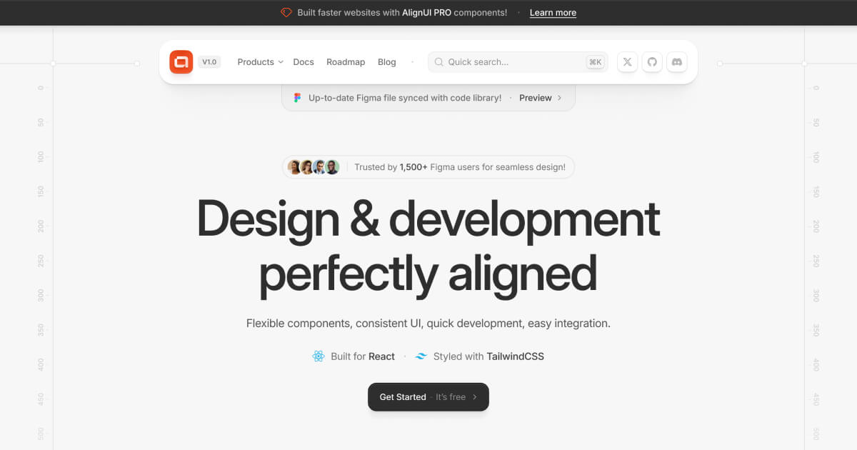
Design and development perfectly aligned
What it is
AlignUI is a design system that provides synchronized UI components for both design in Figma and development in React. It is designed for front-end developers and UI/UX designers working on web applications who seek to maintain consistency between design and implementation. The system aims to accelerate the development process through pre-built, customizable elements.
Main Features
Component Library
- 180+ versatile UI components and 500+ flexible sub-components
- Base Components: 40+ open-source components available for free
- Pro Components & Blocks: 100+ ready-made components for rapid development
- Sectoral Templates: Pre-designed templates for various industries (HR Management, Finance & Banking, Marketing & Sales)
Technical Specifications
- Built for React framework
- Styled with TailwindCSS
- TypeScript support for enhanced code maintainability
- Production-ready, pre-optimized code
- WCAG-compliant accessible design
- Dark mode support
- Responsive design for multi-device compatibility
Design Integration
- Always-updated Figma file library synchronized with code components
- Comprehensive design kit for seamless UI/UX workflow
- Customizable theme options (colors, corner radius, light/dark modes)
How it works
Component Implementation
Developers import and use pre-built React components with customizable properties. The system provides various button variants, form elements, navigation components, and data display elements that can be easily integrated into existing projects.
Design-Development Workflow
Designers use the synchronized Figma library to create interfaces, while developers implement using the corresponding React components. This ensures visual consistency between design mockups and final implementation.
Customization Process
Users can customize primary colors, theme options (light/dark), and corner radius settings through CSS variables and component properties, allowing adaptation to specific brand requirements.
Key Points
- Maintains perfect alignment between design (Figma) and development (React) environments
- Offers both free open-source components and premium pro components
- Trusted by 1,500+ Figma users for seamless design implementation
- Provides sector-specific templates for common application types
- Includes comprehensive documentation and community support
Additional Details
- Pricing Structure: Free tier available with 40+ base components; Pro version with 100+ components and templates requires purchase
- System Requirements: React framework, TailwindCSS configuration
- License: Base components use open-source license; Pro components have commercial licensing
- Community Support: Available through Twitter, GitHub, and Discord channels
- Version: Currently at V1.1 with ongoing updates and roadmap
- Templates Available: HR Management, Finance & Banking, Marketing & Sales, with Cryptocurrency and AI Product templates coming soon